Ink & Color for Your Invitations
This season I’ve had a handful of brides who we in the print biz would call, “color conscious”. And why shouldn’t they be? Choosing your wedding colors is an important decision. Color is used everywhere, from the bridesmaid dresses to the floral arrangements…and of course the invitations and day-of paper.
I try not to go all paper-nerd on my clients, but I thought it would be helpful to explain how print works when it comes to color, and what kind of expectations you should have when you get your pretty paper in the mail or the proof in your inbox. (I promise there will not be an exam at the end of this post!).
{Color in Print}
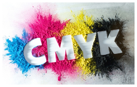
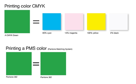
Let’s start with flat printing (i.e. digital printing). This is a good chunk of what I do for my clients, and it allows for lots of color options. Unlike other print methods, the art files go straight from a computer to the printer. (Think about how you print something from your home computer, but a whole lot fancier). The way this color goes is by mixing 4 types of ink. You’ve probably all heard the term CMYK, which stands for the 4 inks: cyan, magenta, yellow, and black. Every color is created by a mix of those 4.
But ink-mixing is not an exact science, and color consistency can be well, difficult. The single print run done for your order should be consistent, but if we have to do another print run or print on different paper stocks (e.g. a glossy sticker paper for your return address labels vs. a heavy card stock for your invitations), the color is not going to be the exact same. Ink saturation, printer calibration…I’ve got variables and syllables to boot. Many don’t even notice, but if you have a serious eye for color, you may catch it.
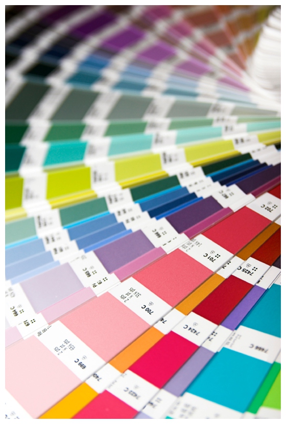
Now letterpress, for example, uses a different print method and actually goes on a printing press. My letterpress clients will hear a lot about printing 1-color vs. 2-color because Pantone ink colors are used (i.e. spot colors), which are individual inks of an exact color. I’m sure you’ve seen Pantone through wedding planning or Pinterest-pinning frenzies, because it’s a great system which standardizes color. (Check out this link to learn more: Pantone color info.) Although there’s technically a CMYK equivalent for each Pantone color, the colors are a close approximation at best.
{Color on Web}
I send digital proofs for 99% of my orders. You check the PDF of your iPhone or your computer, and the color may look totally wackadoodle. You think to yourself, did this paper chick completely forget my specific wedding colors? Certainly not!
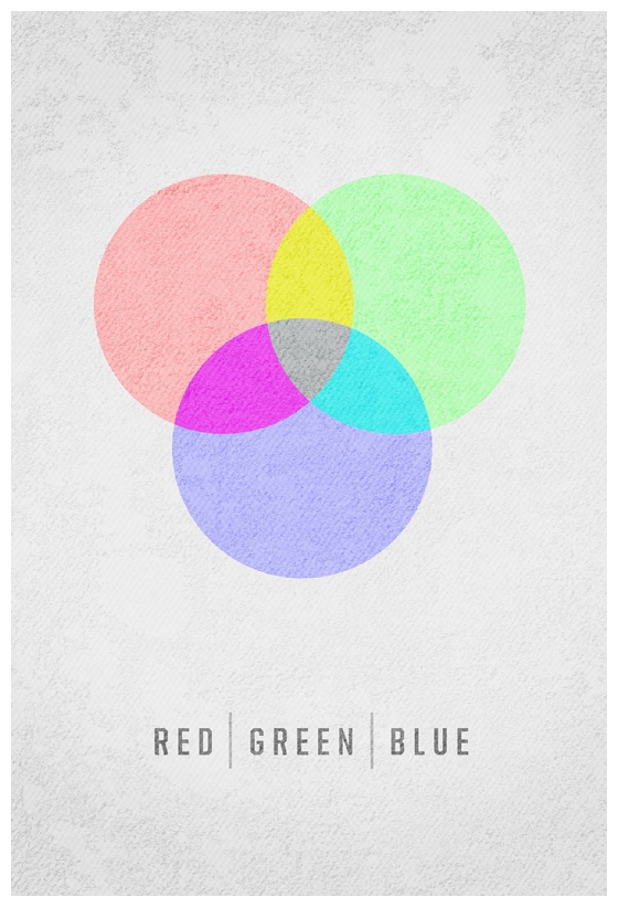
Computer screens use the color format of RGB (red, green, blue). This color is created by light instead of ink. And as you may guess, something that is made for print is not going to look the same for web. Making things even more complicated? Each computer screen is set differently, so the color you see on your computer may not look the same on your fiance’s. This is perfectly normal and has no direct correlation to your compatibility as life partners.
I’m sure you were hoping for some great solution at the end of this post, but the fact is there isn’t one. The best thing you can do is embrace your color palette, and be flexible with your wedding color wheel! The blues from your hydrangeas aren’t going to match the blues from your menu cards, and that’s okay. Dare I say, it’s what makes it a little exciting!
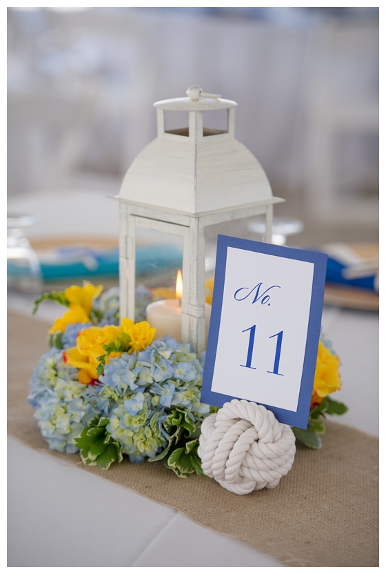
{Table numbers for my 8/3 bride. Photo courtesy of Brooke Allison Photo.}
I think the best part about color is that it is fluid. A photographer may style your green wedding shoes against a dark wood table, or gasp at how the sunlight adds a glow to the ivory lace on your veil. Color is in the eye of the beholder, and it’s ever-changing.
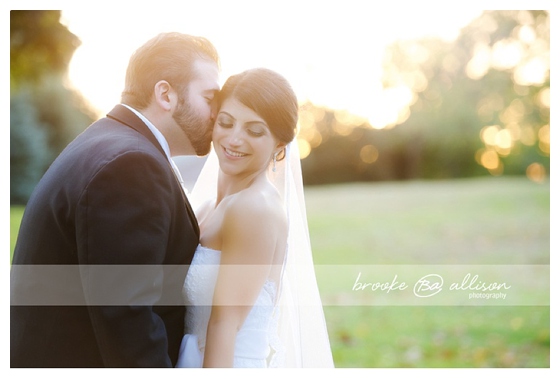
{Thanks Brooke Allison Photo for letting me steal your photo from Pinterest!}
So please still bring your bridesmaid dress swatches to our meetings, and feel free to mail me your table linen samples….I love references and guides! But embrace the flexibility of color, and trust that this paper girl’s got your back.
This was a great read! I’ve been doing graphic work for quite some time, now, but never really printed any of my work. Just recently I printed a piece of work and wondered why the color wasn’t exact. It was, obviously, the same color, just a slightly different shade. Like you said, some people have an eye for color and notice that little difference. I thought it might be something with the printer. Thank you for explaining exactly what I’ve been wanting the answer to!