Day-of Stationery: Do I Need Menus at my Wedding?
For the next series in my “All About Day-of Stationery” post, I am answering the question, do I need menus at my wedding? The answer: absolutely!
Now, there’s no denying I am partisan in this discussion. I am a stationery designer, and believe in its value beyond just your wedding invitation! (In fact, that’s why I started this series on my blog post. Check out the first of the series here all about ceremony program.) But let me lay out my argument for you…
Menus are considered one of my standard elements for every wedding. Whether you have a buffet, plated dinner or family style, you’ll need to tell your guests the menu in some way. And yes, even if guests pre-selected their entrees on the RSVP card, you still need menus. Why? 1) Guests don’t always remember what they selected; 2) They only selected the entree. You want to share with guests the accompaniment to their protein, along with the starter + dessert! And finally; 3) Your wedding is an affair, not just another dinner at home. You want it to feel special and that guests are being treated to a night out. A menu is an essential part of that experience!
Now, your venue may have told you menu cards are included in your package with them. You think, “Great! Another thing checked off the to-do list plus I get more bang for my buck.” But as I tell guests, you get what you pay for. Though your caterer or venue has the best of intentions, often times they design a very basic-looking menu, not taking into account the look + feel of your wedding. Plus they are often printed on flimsy paper. If we’ve taken the time to create your beautiful wedding paper story, and you’ve put so much thought into the overall tablescape, don’t spoil it with a haphhazardly-designed menu! Okay, I’ve said it…now let’s get to the fun stuff!
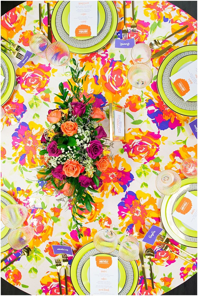
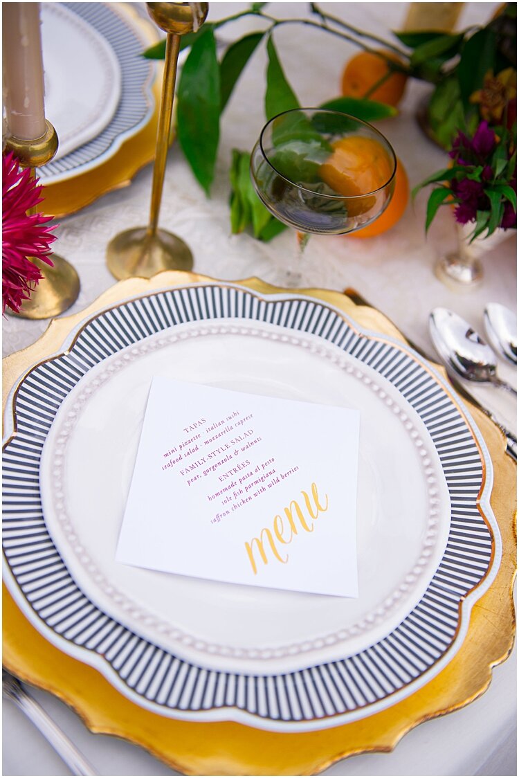
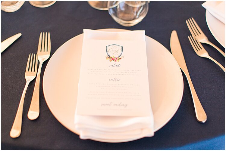
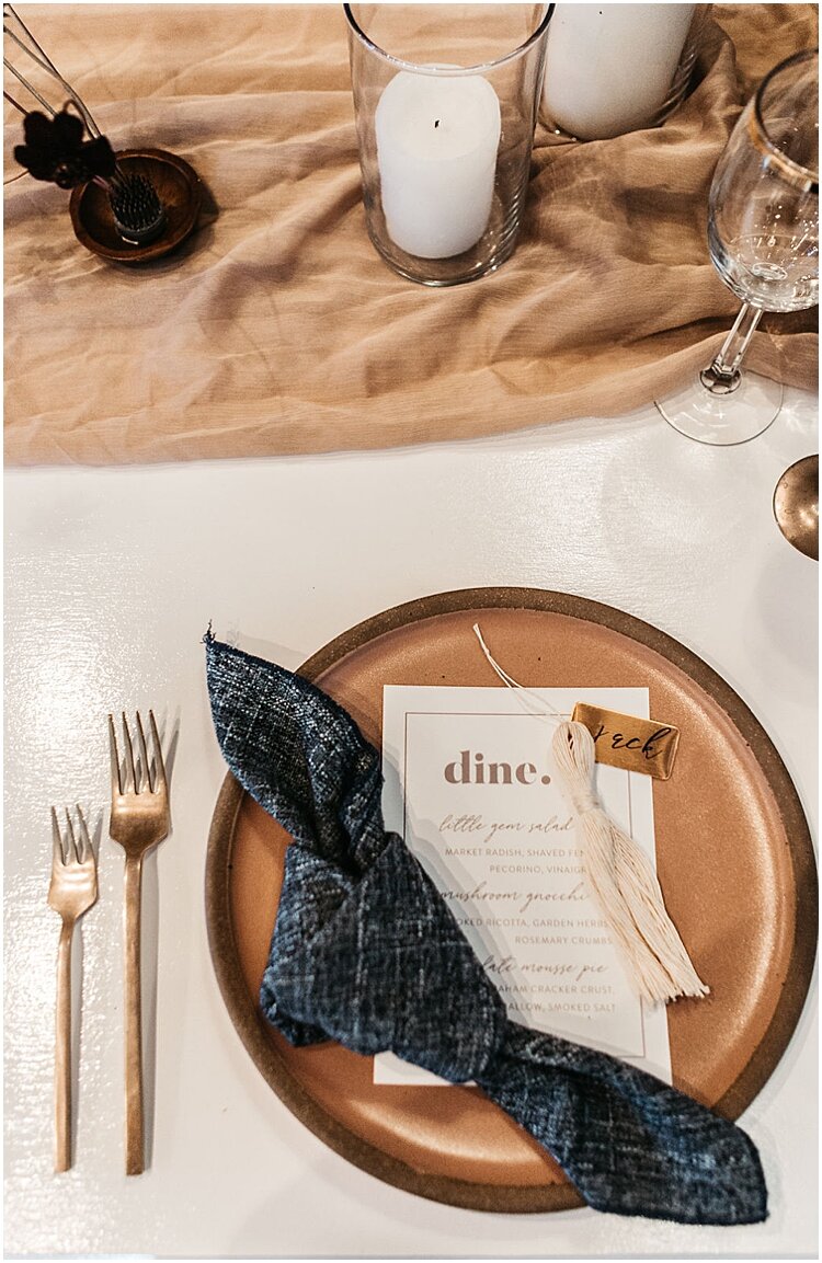
Like with all things weddings, there is the standard/traditional way menus are done, and the many alternate ways that can add some style (and sometimes be more budget-friendly). So let’s start with tradition: the wedding menu at each place setting.
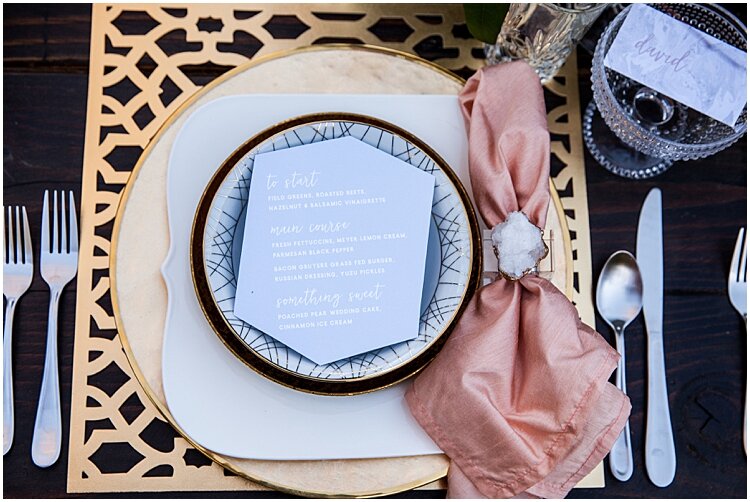
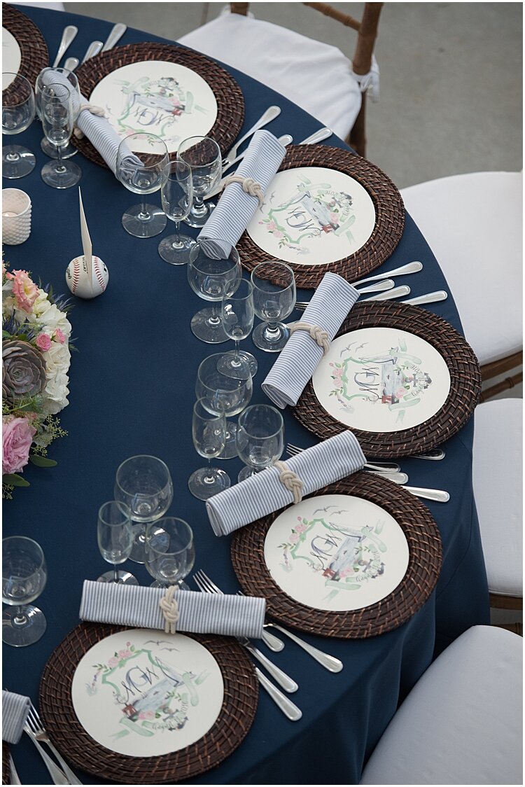
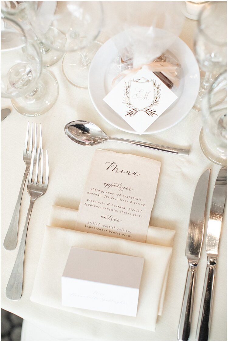
There are typically two sizes: the 5×7”h (same size as a standard wedding invitation card) and the #10 card size, which is long + skinny at 9.25×4”h. Be open to whichever size, because often the amount of text on the menu or the design we include can dictate the best size. This traditional menu at each place setting is a great way to show off a custom watercolor crest or wedding logo! Also, think about what will be surrounding the menu. For Elsye + Richard’s rehearsal dinner, they had a favor with their wedding crest above the plate, so we opted to keep the menu simple + elegant. (We also printed it on blush handmade paper to add some texture + subtle color to the place setting.)
Now just because you’re doing the traditional menu at each place setting doesn’t mean you can’t have a little fun! One of my favorite ways to add dimension to a place setting is with a die-cut menu. You can do a large round menu to fit inside the plate (be sure to confirm the diameter of the top plate with whatever vendor is supplying your china!), a diamond, or a totally custom shape. The sky’s the limit.
Now let’s move on from the traditional one-menu-per-guest, and explore some alternates. I always tell couples doing alternate menu displays adds a modern splash to your reception, and often can save you a little money on printing costs.
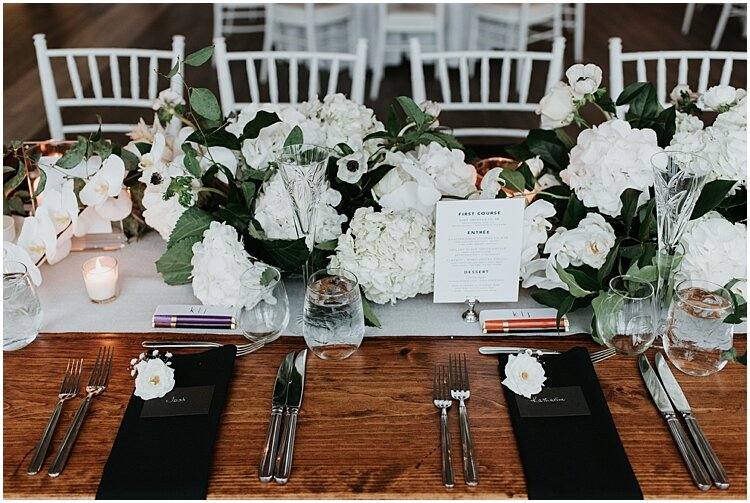
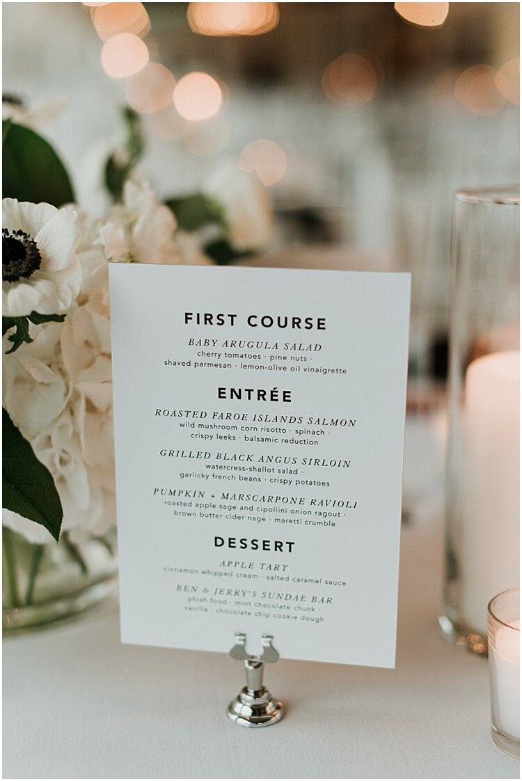
One of my favorites is displaying menus in the center of the tables. One menu per round table usually works, but if you are having long tables opt for one per every 6 people. The menu is still a part of the decor, but is connected more to your floral centerpieces than the flatware + china. You can also do a slightly larger card and add the table number in as well.
I love how my bride Katharine tucked her menus into her plush black, white + greenery centerpieces that went the length of the entire table.
Pro Tip: Do them two-sided so guests on either side of the table can view at the same time!
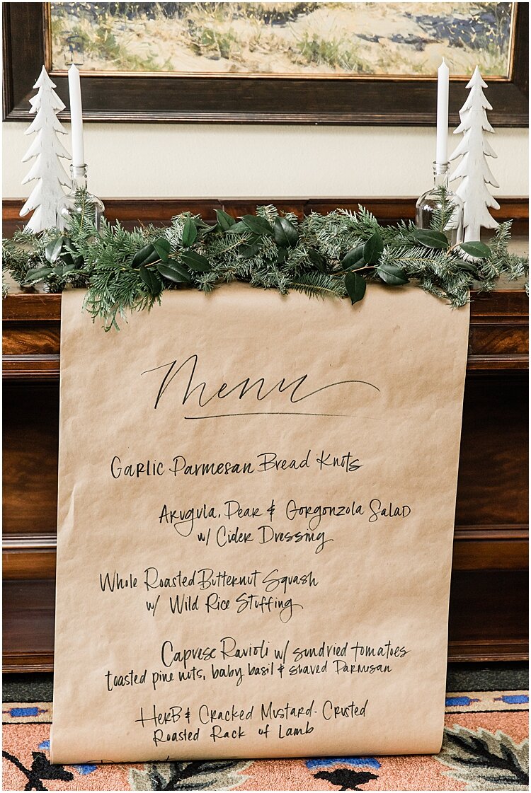
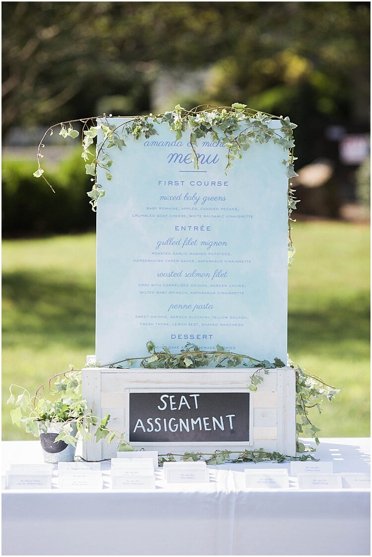
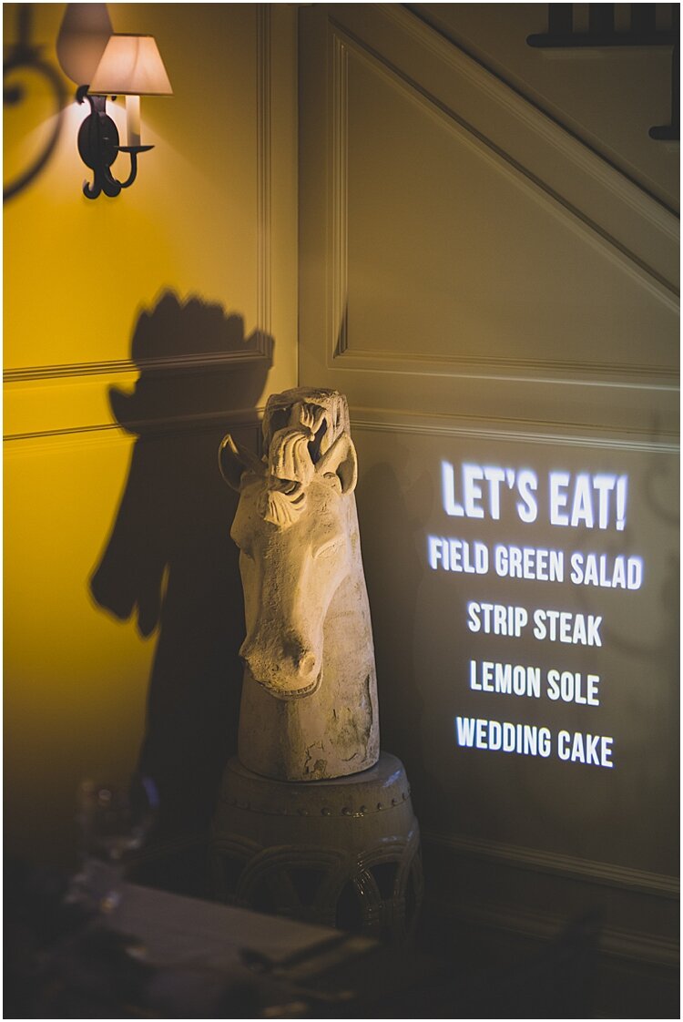
Next is displaying the menu as a large sign. I recommend displaying this near the entrance of the reception area, or a focal point in the space (e.g. the fireplace) so guests don’t miss it. This is a great option for weddings that have a more fun + easy-going vibe, and what I love about this concept is that it serves to set the artistic tone of the wedding. And yes, that last image is a menu projected onto a wall. This can be a fun collaboration between your stationery designer + lighting vendor/DJ!
So that’s my menu round-up! I always remind couples not to forsake their day-of stationery because it can play such a pivotal part in bringing your look together! And menus can play a big part in that. Whether you opt for the traditional menu atop the plate or something cool + modern to adorn the reception area, making sure your guests are well-informed of the the delicious food to come is a must.
Looking for more insight into day-of stationery? Check out the post all about wedding programs! And don’t forget to follow Roseville on Instagram to keep up with my latest work + highlights.
Photo Credit (from top): Peterson Design Photo, Shaina Lee Photography, Kelsey Combe Photography, Jessica Jaccarino Photography, Carla Ten Eyck, Ashley Therese Photography, Eileen Meny Photography (2), Lace & Lapel Photo, Brooke Allison Photo, BSC Photo, Jenn Morse Photography
LEAVE A COMMENT