Juliana + Michael’s Sonoma Garden Wedding | Featured on style me pretty
I have been waiting to share J + M’s Cornerstone Sonoma garden wedding with you, because it was beautiful and filled with so many amazing stationery details1 It’s so good in fact, that it was featured on the front page of Style Me Pretty!
Juliana and I began working together on her custom logo—along with the wonderful Christine of CMG Events—and we knew we wanted to celebrate the amazing NorCal garden wedding venue, while also highlighting the couple’s east coast roots. (Obviously I connected right away with their love for both New England and Cali!)
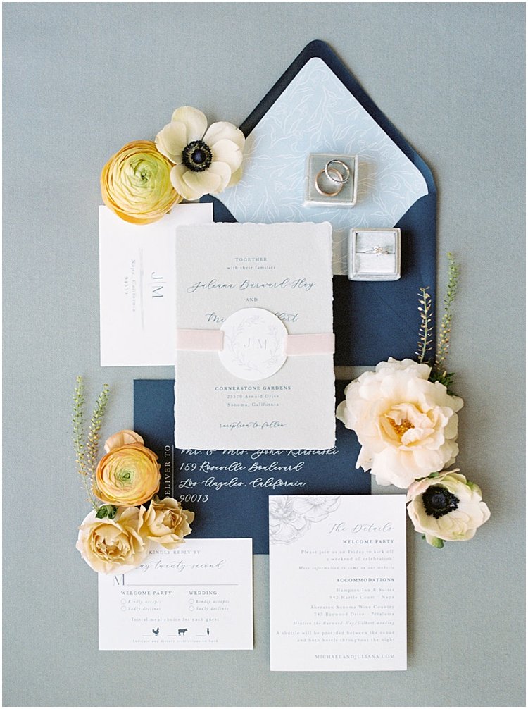
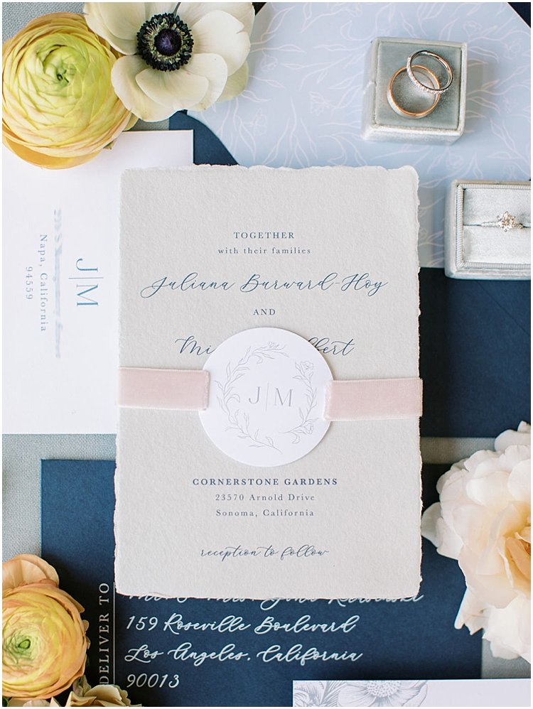
Handmade Paper Wedding Invitations
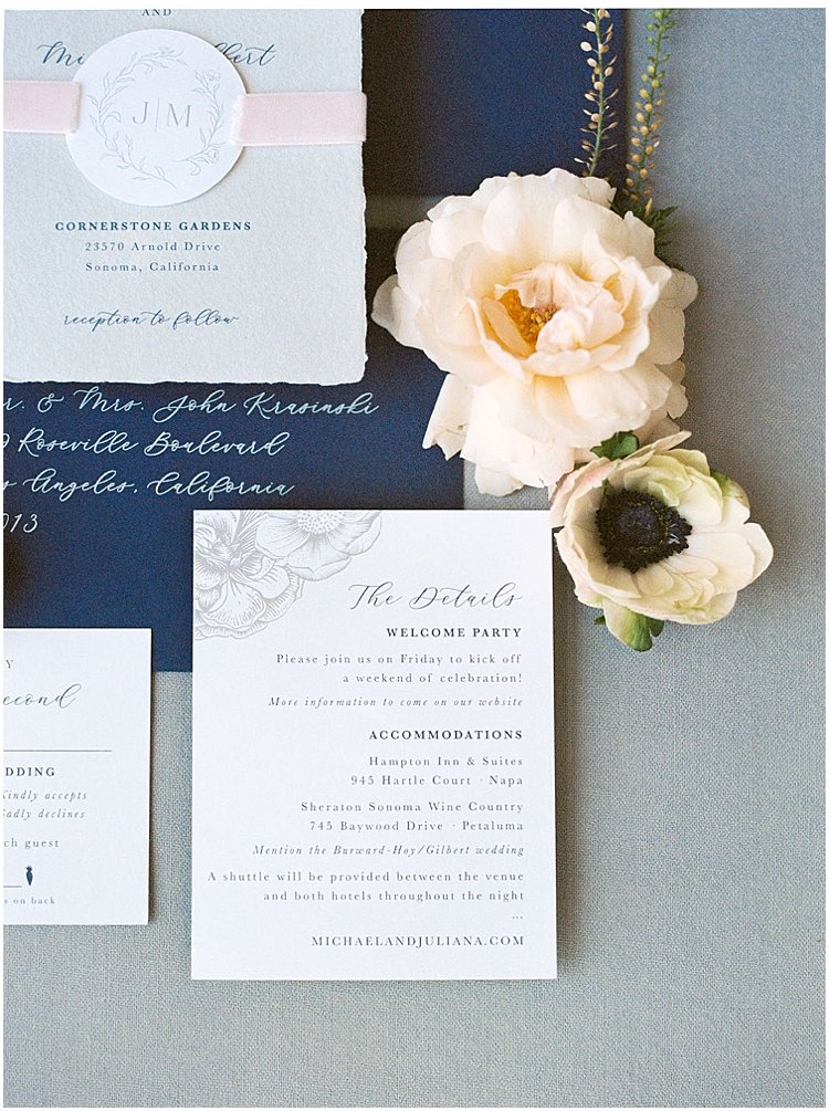
Once we had finalized their logo, it was time to start the invitations. knew I wanted to incorporate a lot of texture, and I had the perfect soft blue handmade paper for the invitation card. I tried something new + fun, sliding a tag featuring their logo onto blush ribbon that served as the belly band for the suite. There was a lot of hand-cutting and hand-gluing for this one, but the final rest was worth it! We added a floral graphic to the details card as well, knowing it was a design element we could pull from for day-of stationery. It’s important to think about the bigger picture when designing the save the dates + invitations, and what you can use down the road for the elements at the actual wedding!

![]()
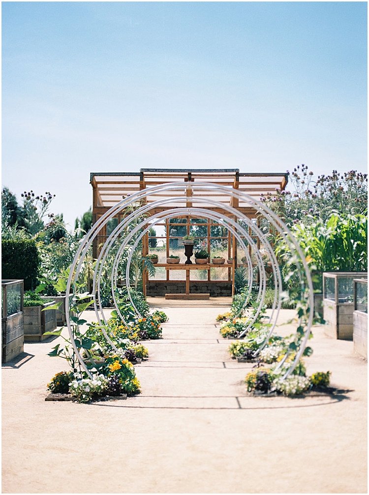
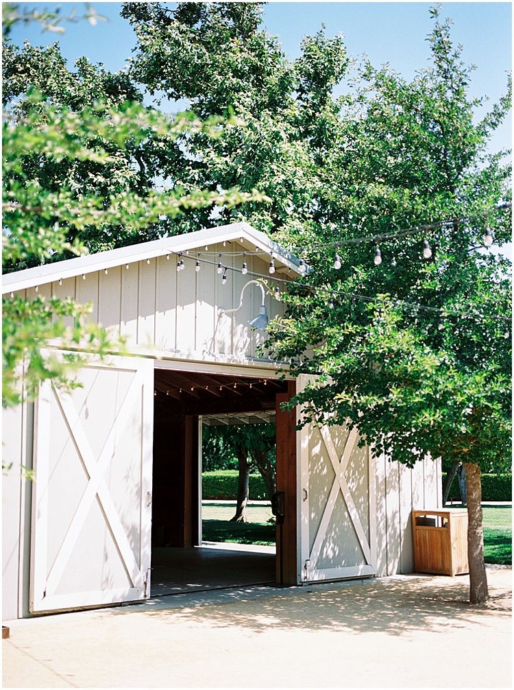
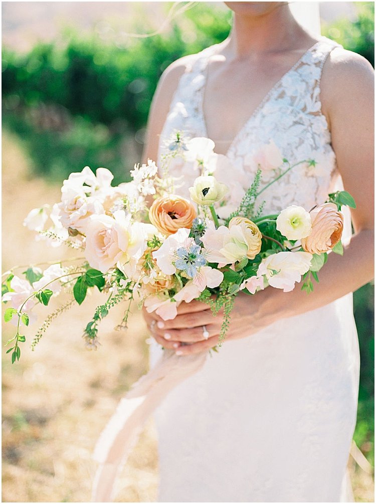
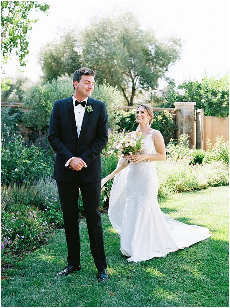
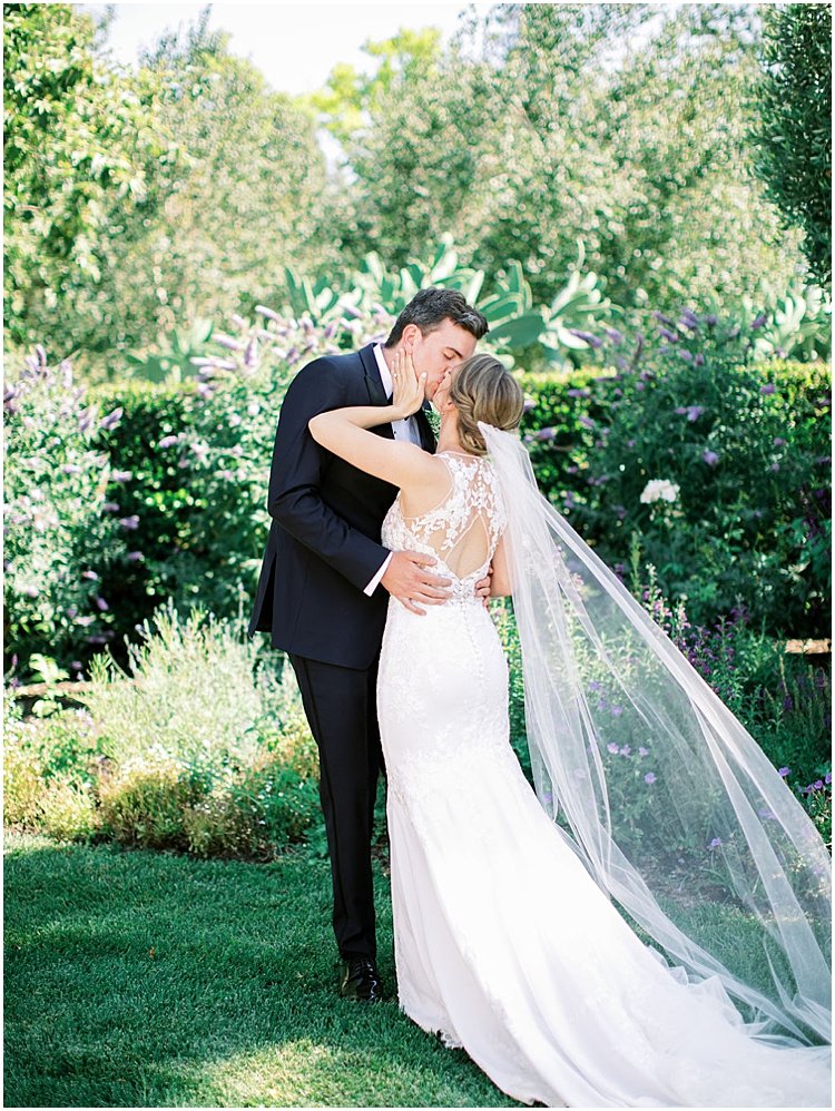
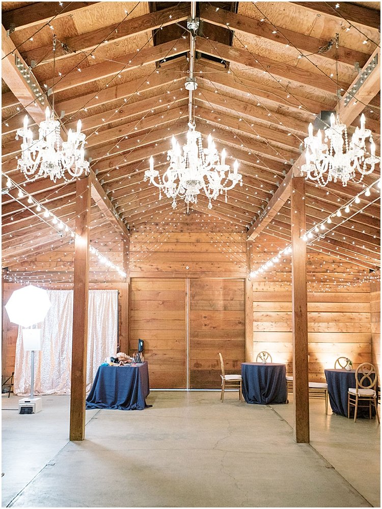
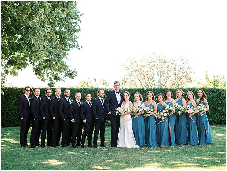
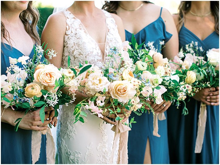
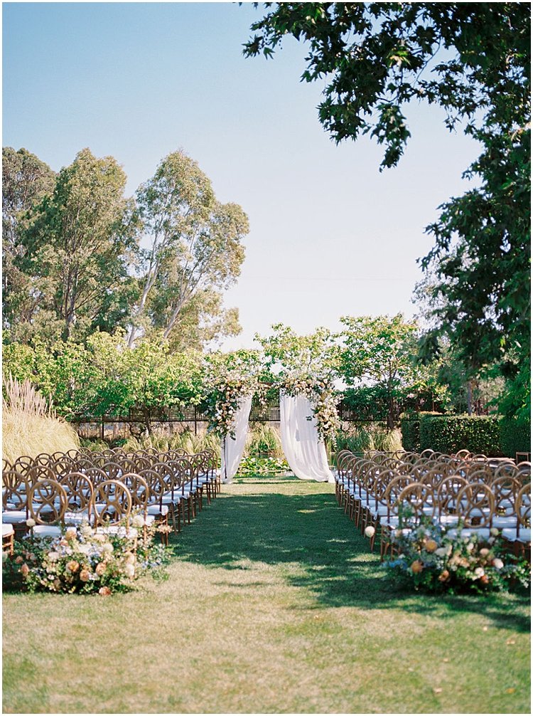
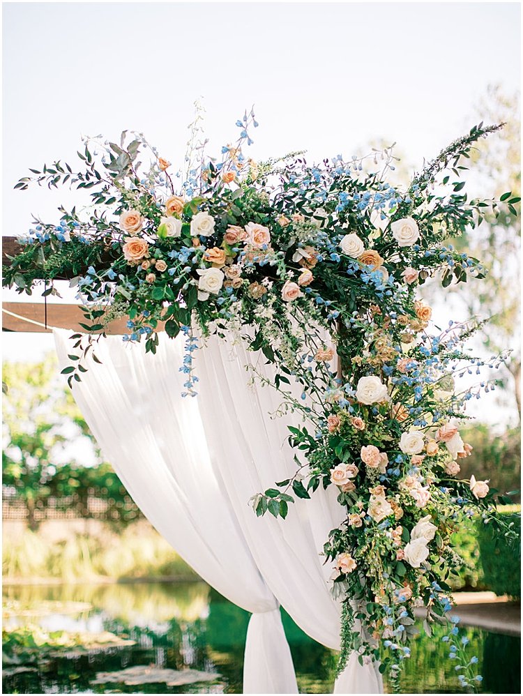
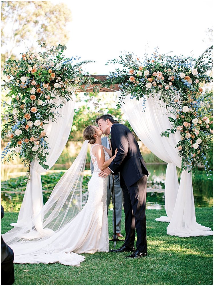
Cornerstone Gardens has so many buildings and spots for amazing decor and photographs. From the barns to the open space they used for the ceremony, they were able to lean on the natural beauty of the Sonoma venue while also infusing their own design aesthetic. Their palette of shades of blue with pops of blush and other neutrals was classic while also fresh + fun. Perfect for a romantic garden wedding soiree!
Garden Ceremony Wedding Stationery Details
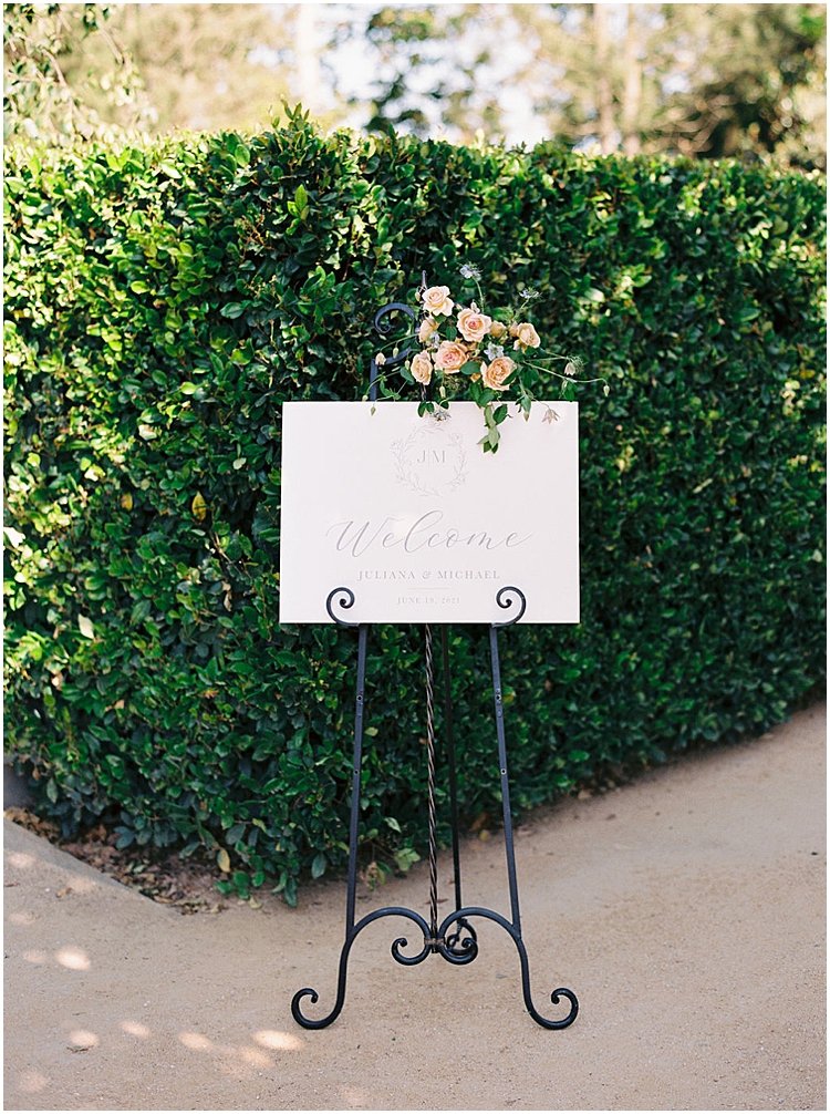
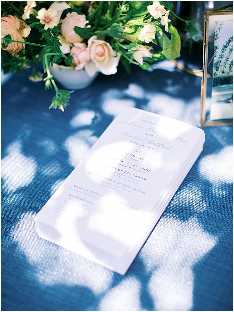
The three main parts of day-of stationery are: ceremony, cocktail hour, and reception. Though the reception is usually the focus for couples, don’t forget the ceremony is truly what the wedding is about (uniting in marriage!), so it deserves elements that you can have as mementos for your lifetime. They don’t have to be expensive or complicated! Just look at Juliana + Michael’s ceremony. We first has a simple welcome sign at the entrance of the ceremony (which can be repurposed at the front of the reception space!), and a simple, elegant 2-sided program. Most people think of the traditional folded program you get, particularly at religious ceremonies, but as long as you don’t have a long + detailed ceremony, you can usually fit those details, the wedding party, and a note to guests or list loved ones who have passed without issue.
Tip: If it doesn’t all fit, you can display a framed sign at the reception celebrating loved ones who are not able to be at your wedding day.
Personal Details In Your Wedding Stationery
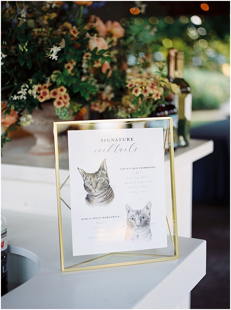
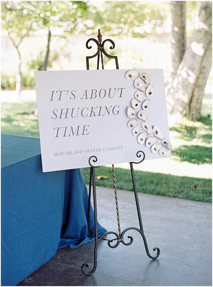
Two of my favorite details fo their wedding (and the images that got me the most likes in 2021!) are the signature cocktail sign and oyster sign.
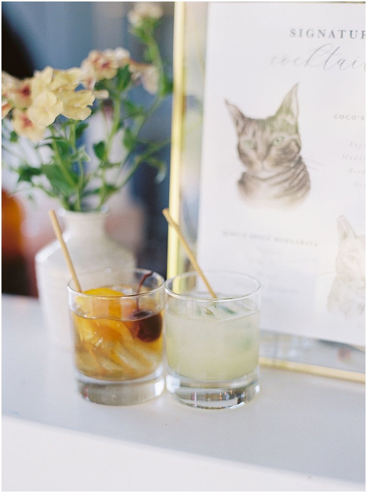
So many of my couples are pet lovers, and Juliana + Michael really wanted to incorporate their 2 cats into their wedding. I called in one of my favorite artists, Letter Lane Design Studio, to paint their two feline buddies so we could put them on their signature cocktail sign. The cocktails were named after them, so it seemed fitting to have their lovely furry faces front + center! Custom watercolor pet illustrations are an investment, but it’s something you have forever. Usually my couples print them to frame in their house, so from my perspective they’re worth every penny!
The second element was their It’s About Shucking Time mounted poster sign, a way to poke fun at the COVID pandemic wedding postponements. If you’re a New England lover, oysters are an essential part of your wedding menu! I designed + printed the sign, and Christine’s team glued the real oyster shells on it. Such a fun and delicious moment for guests!
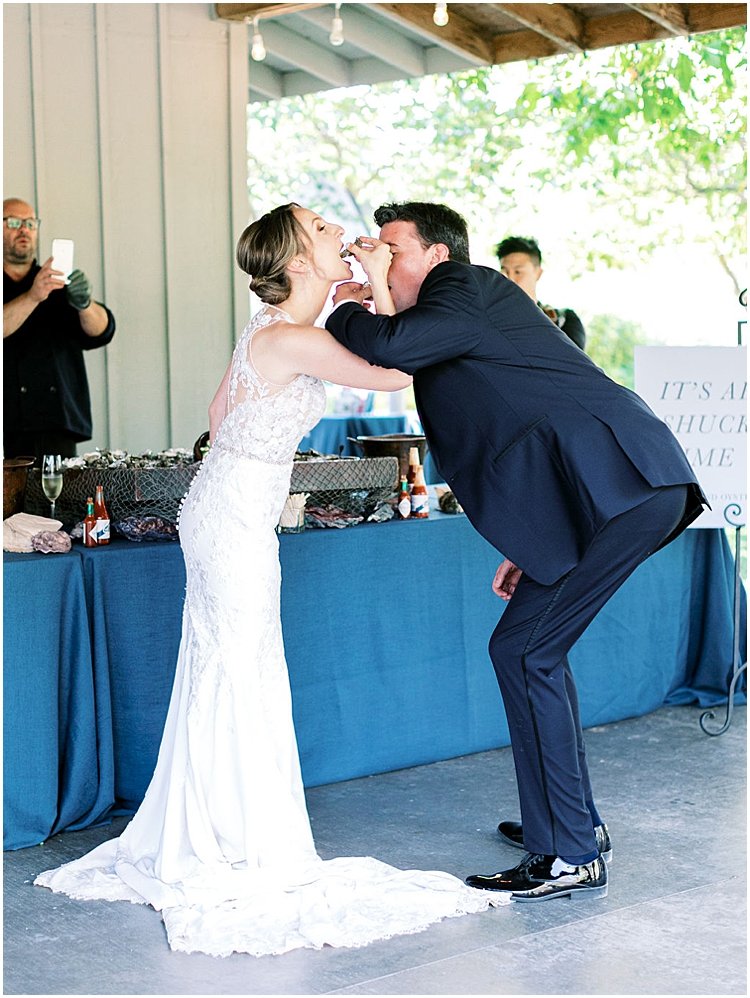
Now if you’re going to have oysters, you’ve gotta have champagne!
Escort Card Wall Display Ideas
I always love an escort card display moment. It’s the transition for the guests from cocktail hour to dinner and dancing, so you won’t to set a celebratory tone. I worked with the bride, Flower Girl Em and the CMG Events team on this concept. This is why you hire full-service vendors. They collaborate (and often do things behind the scenes you don’t even know about!) to create amazing details—big + small—-for your wedding! This wall certainly had big + small details. I designed the “sip and be seated” text and had it printed on wood then painted. This is slightly more expensive than foam core, but it’s more eco-friendly.
Tip: Your planner or venue may but a large sign off of you to use on future weddings!
I then had an escort card for each guest laser-printed on acrylic drink stirrers. It really was a “wow” moment, and if I were a guest I’d definitely bring home that piece as a keepsake.
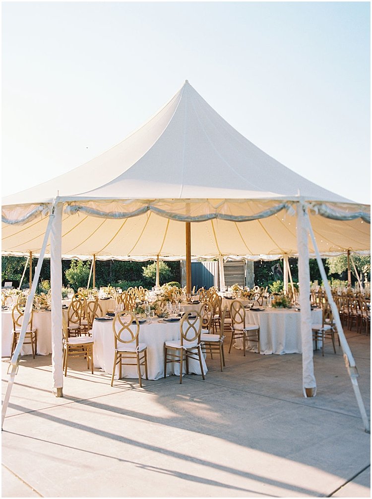
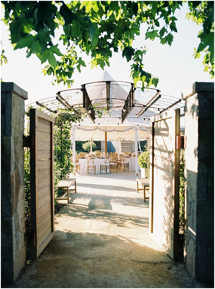
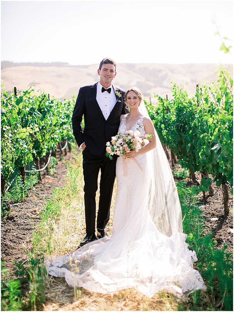
The beauty certainly didn’t stop there, as guests were led into the beautiful sailcloth tent overlooking the beautiful Sonoma garden space. And of course, there were acres of vineyards for that quintessential wine-country wedding portrait!
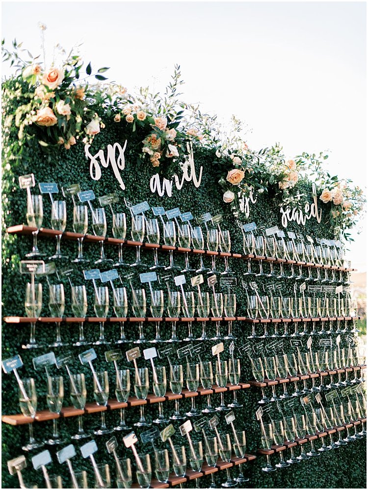
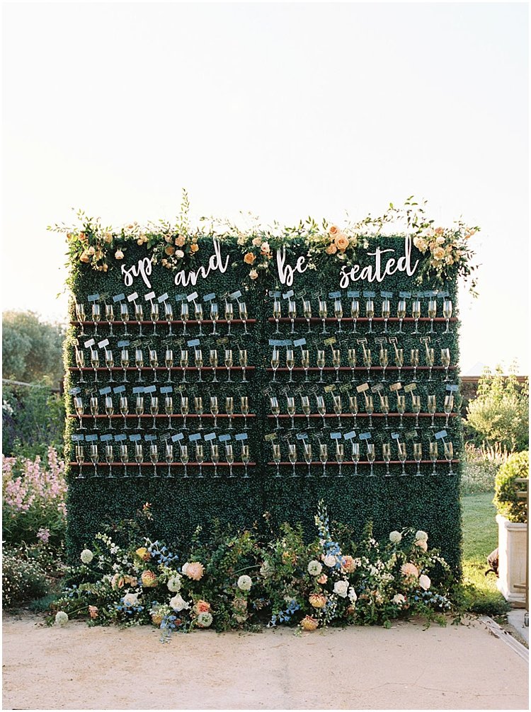
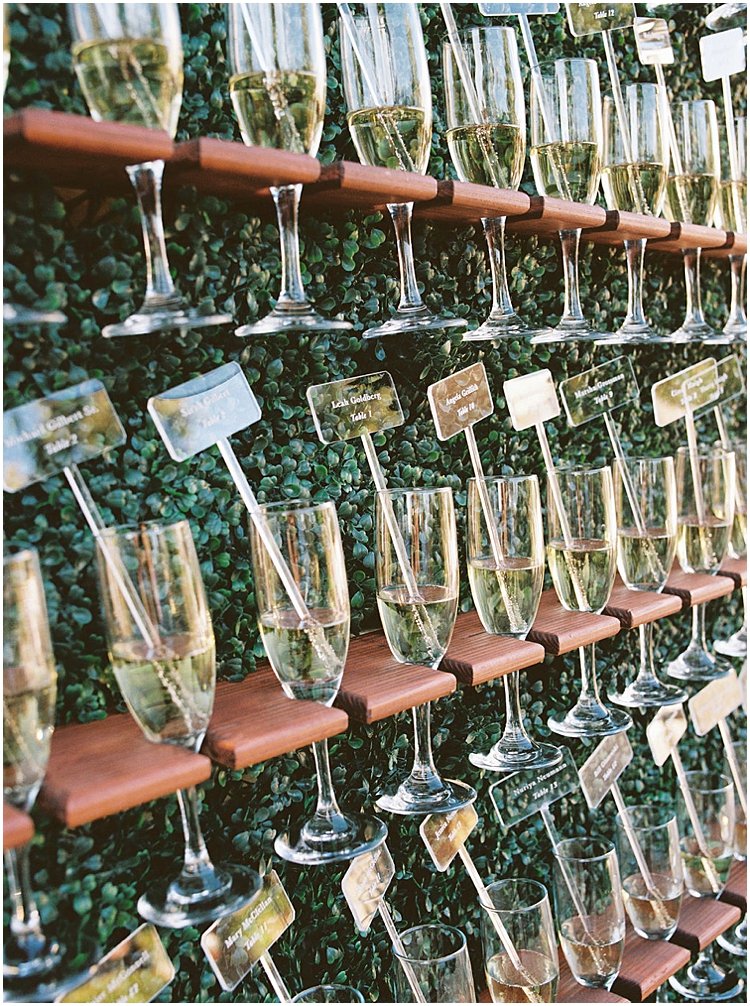
And finally, the reception!
Blue and Blush Wedding Table Decor
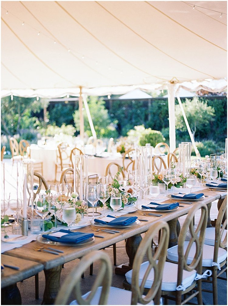
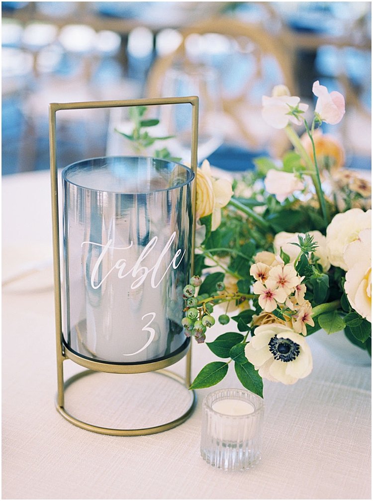
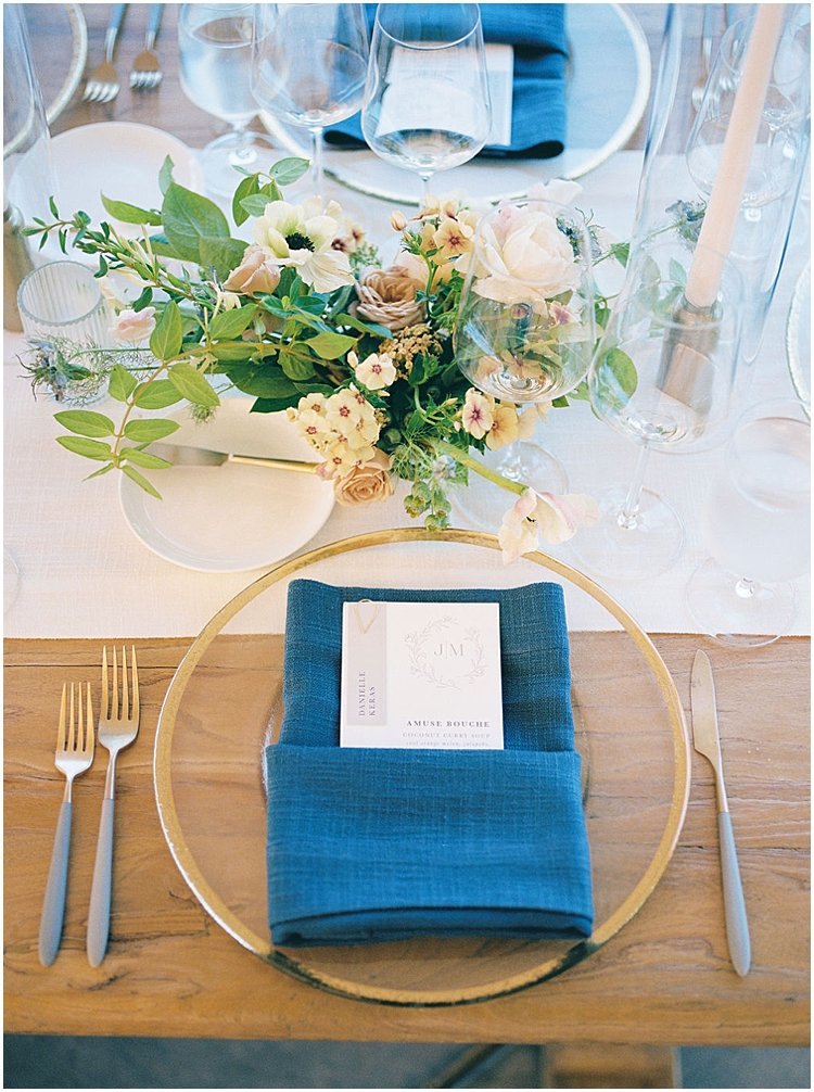
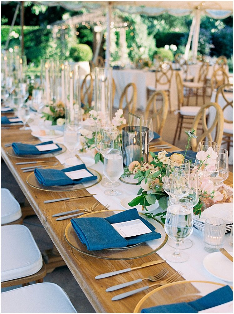
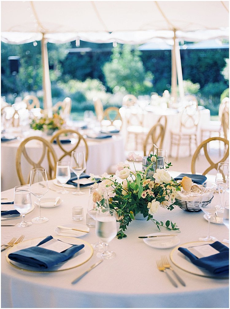
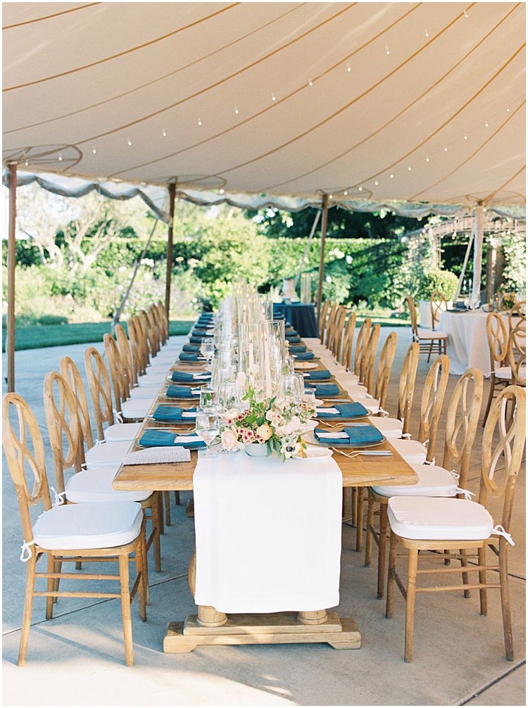
Juliana + Michael’s romantic, fresh color palette was on full display in the reception tent. They had loose, organic florals in a mix of neutrals and blushes atop the round and long, rectangular wood tables.
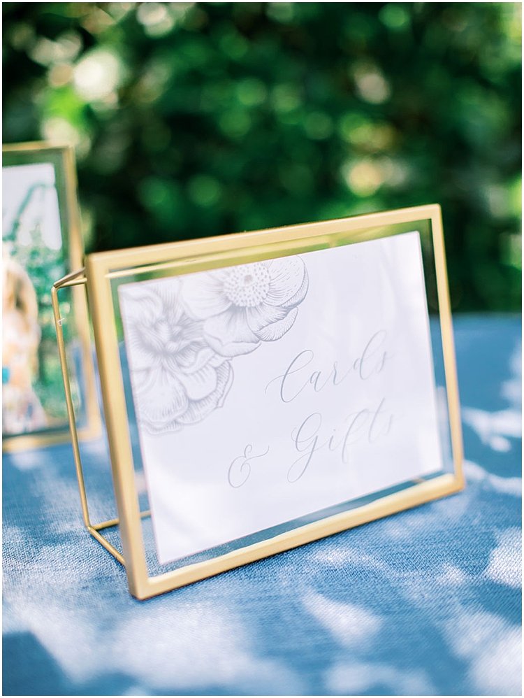
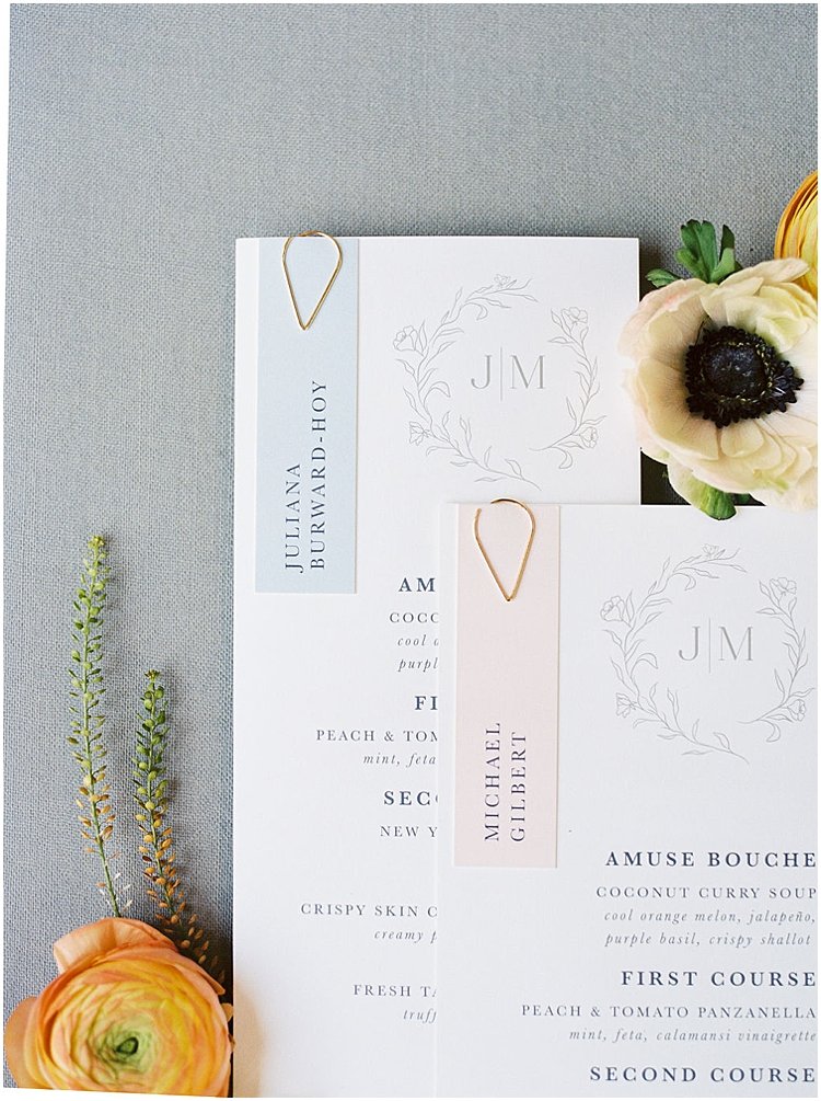
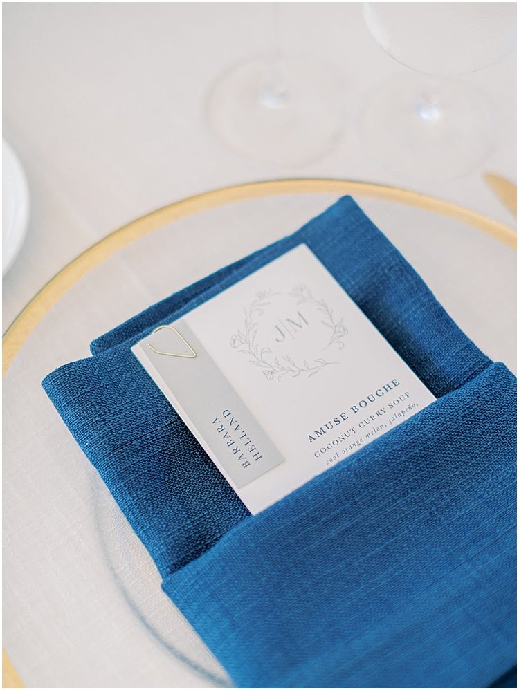
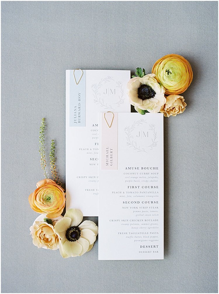
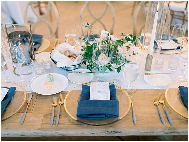
Because Cornerstone Sonoma needs to know the meal choice for each guest, we knew we had to do place cards that differentiated between the three meal choices. In the past reserved for only the most formal weddings, I am really seeing a resurgence in the place card as an added opportunity for paper decor at the wedding reception. Also venues requiring meal choice for each guest is becoming more common. Juliana wanted them to be attached to the menu, so I sourced these clean, simple gold paper clips to add that subtle bit of metallic (also seen throughout the space with the gold framed signage). Cornerstone requires they know the meal choice for each guest, so we color-coded the place card. The final result was a really beautiful mix of colors that still remained neutral so that deep blue napkin could serve as the true pop of color! The final result was quite possibly my favorite detail of one of my favorite weddings of all time!
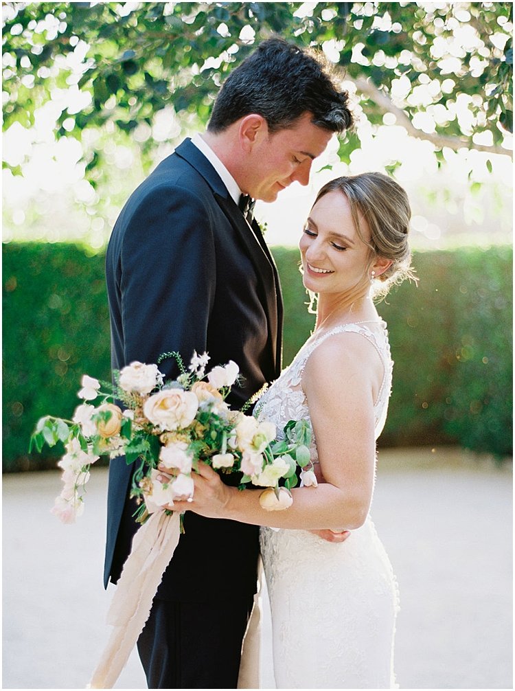

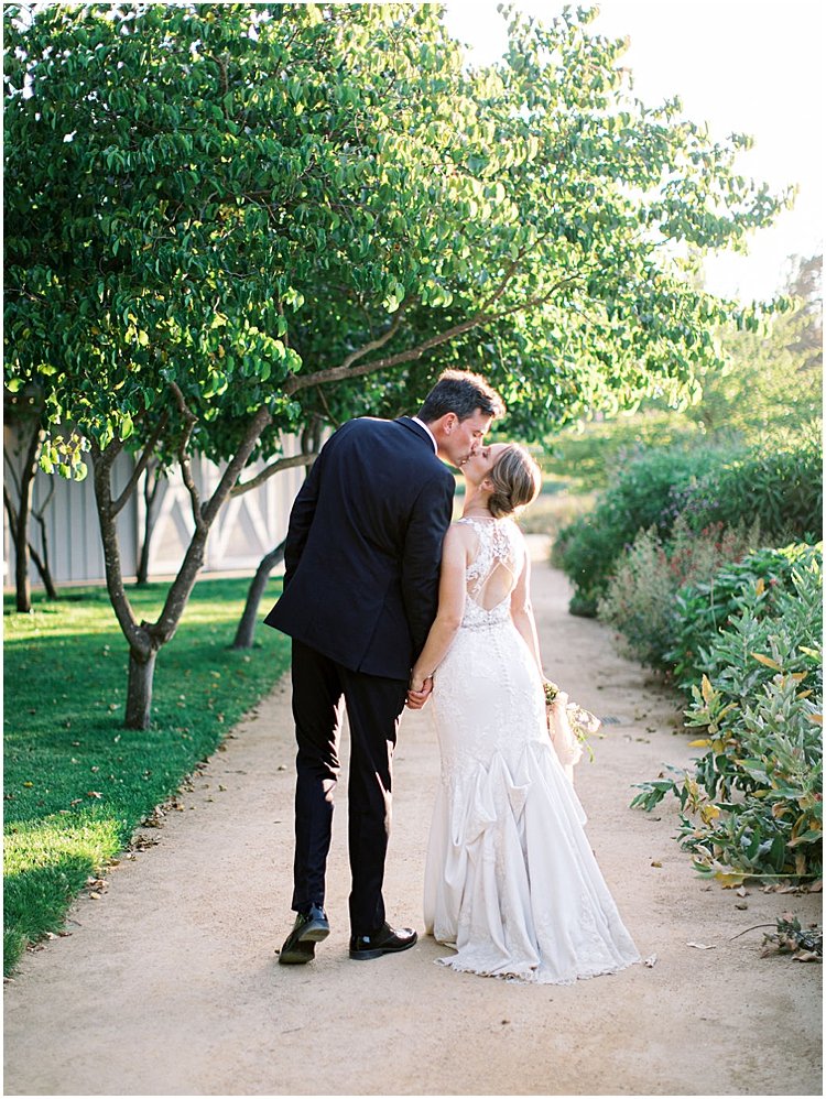
Juliana + Michael, your wedding was truly one for the books! Thank you for trusting me to be creative and honor the vision for your incredible day. I absolutely love everything we created together, and wish you a lifetime of joy (and oyster shooters!).
If you want more romantic wedding inspiration, be sure to check out Ben + Maura’s gorgeous Connecticut museum wedding and Mallory + Hunter’s SoCal Terranea Resort wedding. Unsure of how many invitations to order? I’ve got you covered in this blog post!
VENDOR REEL
Planning + Design: CMG Events
Photography: Rebecca Theresa Photography
Videography: Leap Productions
Floral Design: Flower Girl Em
Cake: Flour & Bloom
Catering: FolkTable
Lighting: Twilight Design
DJ: Vox DJs
Transportation: Pure Luxury Transportation
Venue: Cornerstone Sonoma
Beauty: Bella Bridal Napa Valley
Rentals: Encore Event Rentals
Oysters: Hog Island Oyster Company
Champagne Wall Rental: Lux Event Rentals Design
Stationery, Paper Goods & Champagne Wall: Roseville Designs
Cat Illustrations: Letter Lane Design Studio
Photo Booth: Soskiphoto
Guitar: Stephan Kane
LEAVE A COMMENT