How to Do a Wedding Theme
Today I’m talking about wedding themes, if you need one, and how to do it in an elegant (and not gimmicky) way!
The first question is what is a wedding theme? Back in the day, you chose colors, a dress, and had an elegant evening of celebration. But today, as more couples are choosing to infuse their personalities, interests + style into their big day, the word “theme” has become more commonplace. The funny thing is, though, I find people are very hesitant to use this exact word out of fear it makes their wedding seem cheesy. The word “theme” seems more approporiate for children’s birthday parties, bar + bat mitzvahs, and more playful affairs. Couples fear if they use the word “theme” that I’ll create something kitchy and without formality or elegance. But a word is just a word, and ultimately the point of a theme is simply to set a tone and find ways to pepper in details that make your wedding unique to the bride + groom.
So let’s first explore three of my past weddings that had a theme to give you some concrete examples.
Mallory + David: Baseball Nautical Wedding Theme
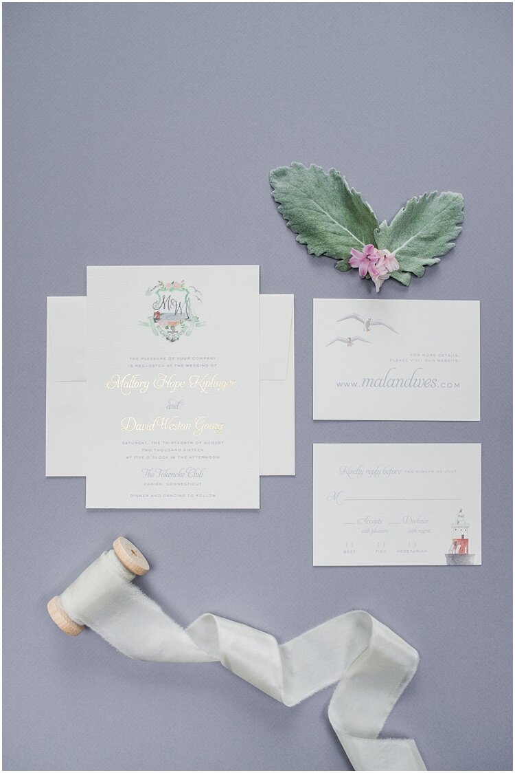
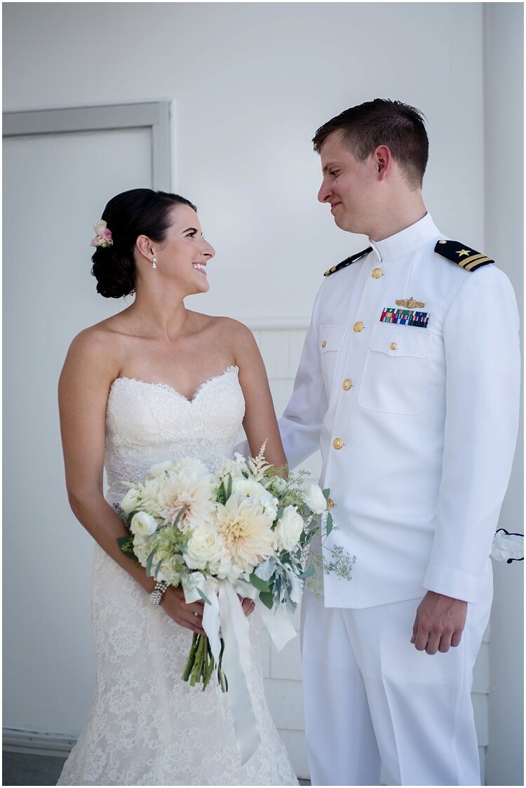
This is most likely the first time you heard this combination for a wedding theme. The truth is it’s the first time I’d done anything baseball related for a wedding, but it was SO fun! Both Mallory + David are huge baseball fans, and it was such a big part of their story as a couple. They were having their wedding at The Tokeneke Club in Darien, which is right on the beach overlooking the Long Island Sound. This is where Mallory would spend summers with her family, so it too had a special place in her heart.
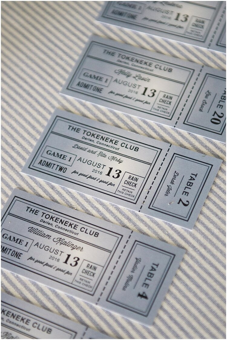
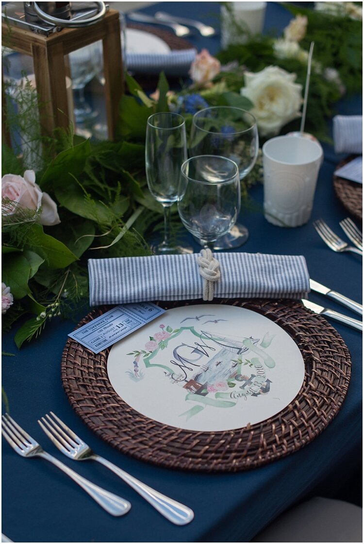
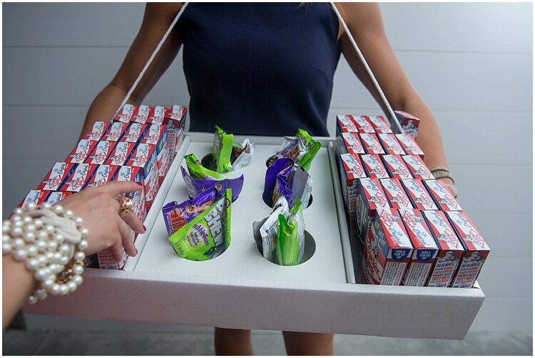
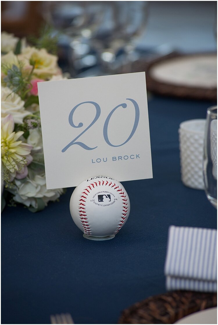
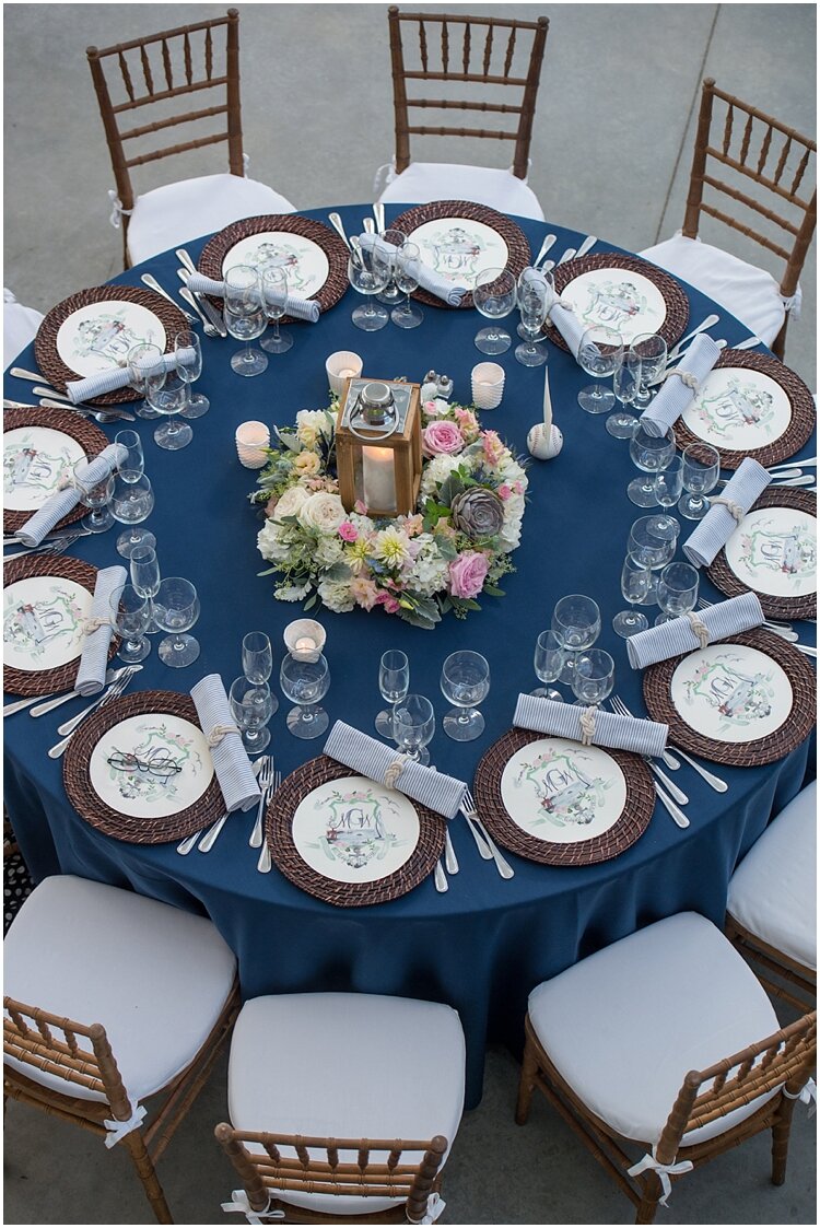
With a theme you need to be conscious of what categories of your wedding you’ll incorporate it, and make sure it isn’t incorporated into every element. With a theme like baseball, that can feel more gimmicky, sprinkle the details, don’t smother with them! The baseball details were used a great deal in her day-of paper goods, with baseball ticket escort cards, baseball card-style programs, and the table numbers which were displayed on actual baseballs. But she didn’t incorporate it into the wedding invitation suite or any of the florals or rentals, instead opting for more of a focus on the nautical. We had a custom watercolor crest, which was a great way to add a romantic feel. The end result of the wedding was elegant but playful, beautifully executed by Amy Champagne Events. You knew they loved baseball, but the wedding was still an elegant affair from every angle.
Invitation Photo: Brooke Allison Photo / Wedding Photos: Carla Ten Eyck
Rebecca + Adam: Fox Hunt Wedding Theme
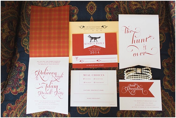
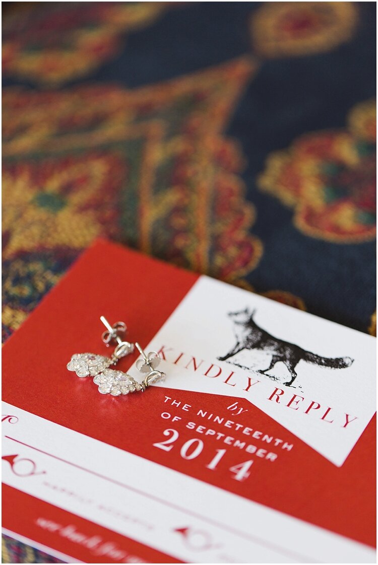
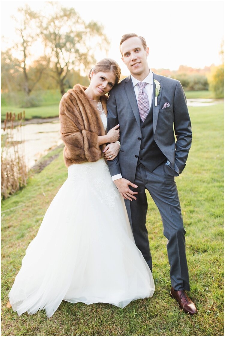
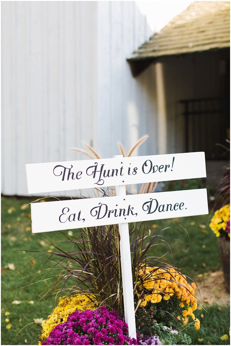
Rebecca + Adam came to me fully invested in their theme, “The Hunt is Over”. They had chosen their venue based on this, and all their wedding decisions were centered around it. The elements of this theme, unlike baseball for example, translated seamlessly into a wedding: rich colors, plaid patterns, iconography, and much more. Because of this, I was able to go full-throttle, and the design process was such a treat! The first stage was the invitation, where I created a bi-fold invitation that featured “The Hunt is Over” right on the front, with romantic fonts, a fox graphic, die-cut shape, and little fox hunt horns on the back flap of the envelope + RSVP card. Guests knew right off the bat what kind of celebration they were in for. This is a prime example that the little details matter!
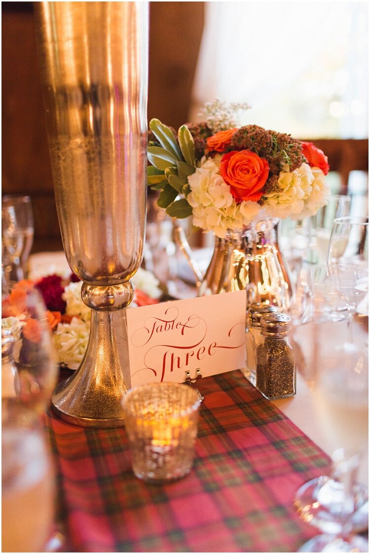
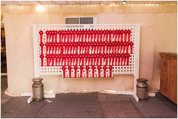
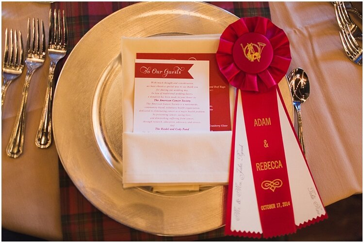
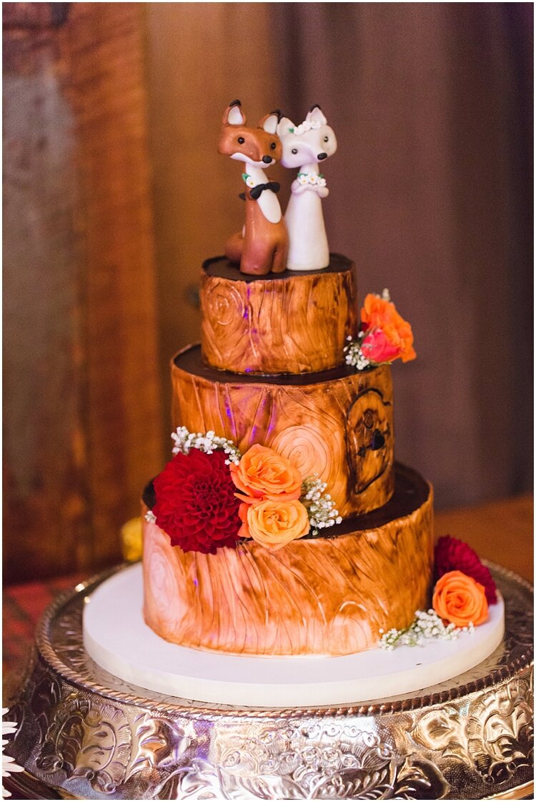
Rebecca also worked with Amy Champagne Events and had lots of thoughtful elements for the reception, including centerpiece vases like trophies + custom competition ribbons for escort cards. (Not to mention the cutest wedding cake + toppers!) I simply carried over the look of the invitation into the menus, table numbers, donation cards and other signage to complement the rich details she had, which paired beautifully with the rustic look of their venue, The Barns at Wesleyan Hills.
Photo: Ashley Caroline Photography
Mary + Craig: Renaissance Theme
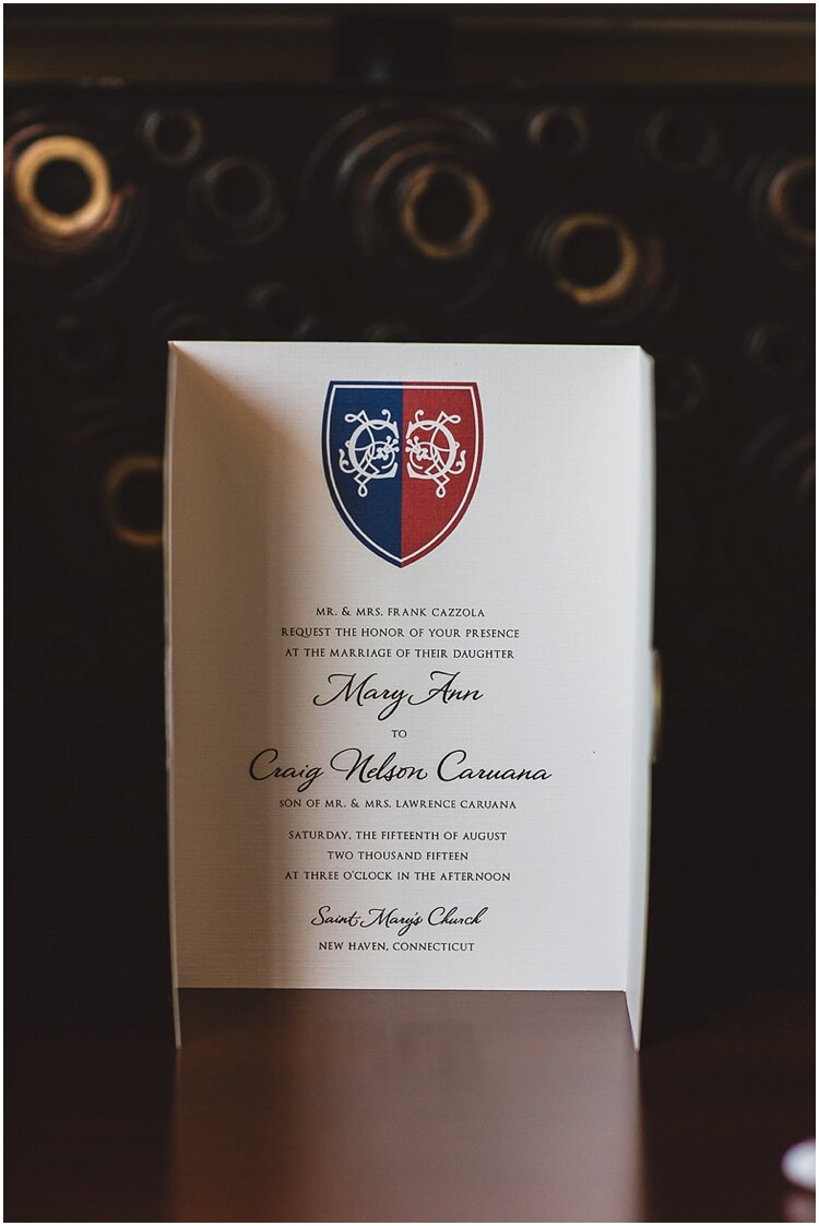
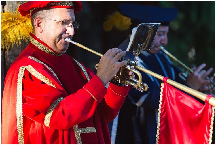
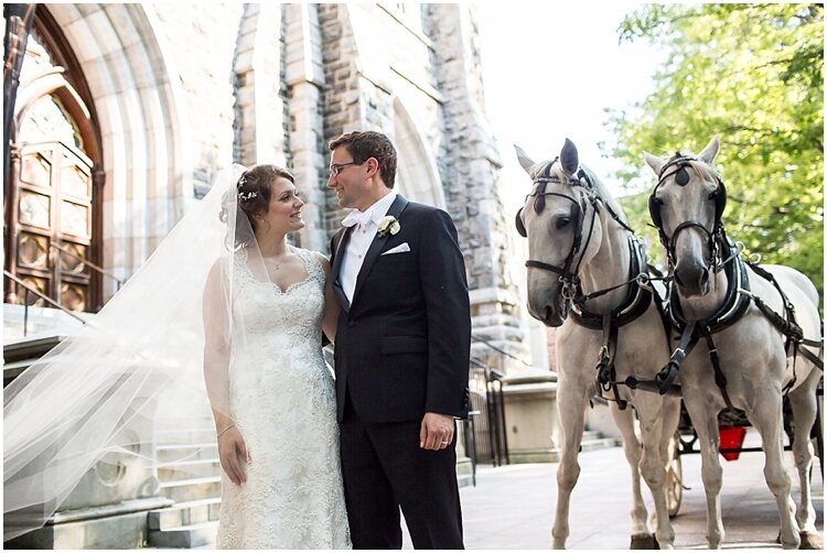
When their wedding planner came to me with his couple’s theme of Renaissance + Game of Thrones, I was a bit apprehensive. But he assured me they really wanted to do it in an elegant way, and I knew there would be a wedding planner in the mix to make sure that happened. So I agreed to do their wedding paper story!
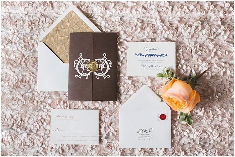
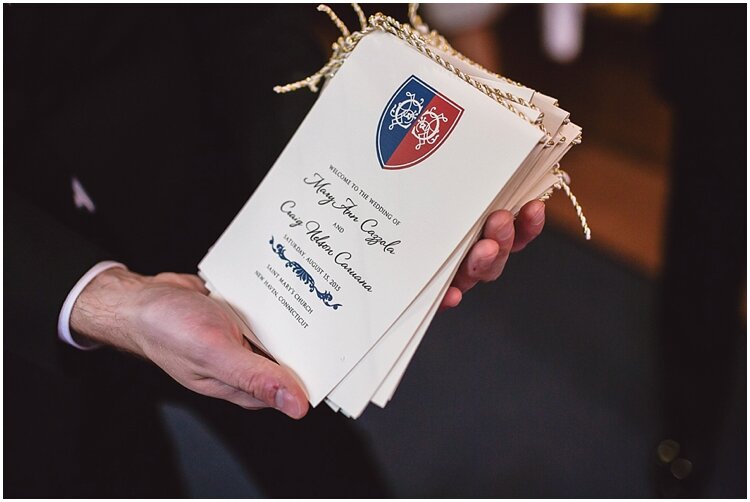
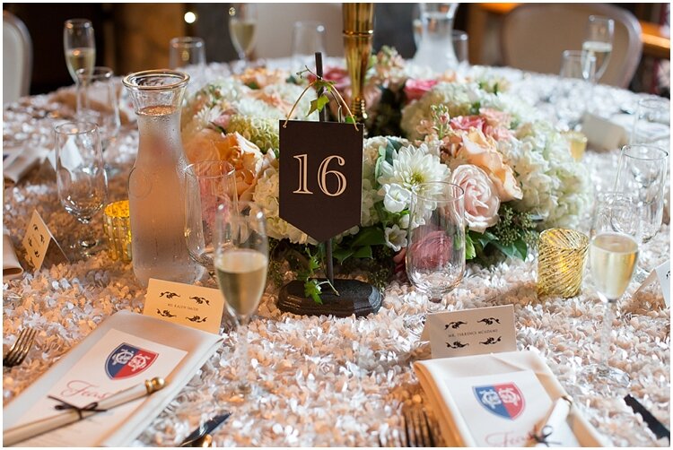
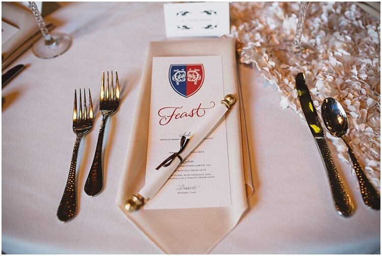
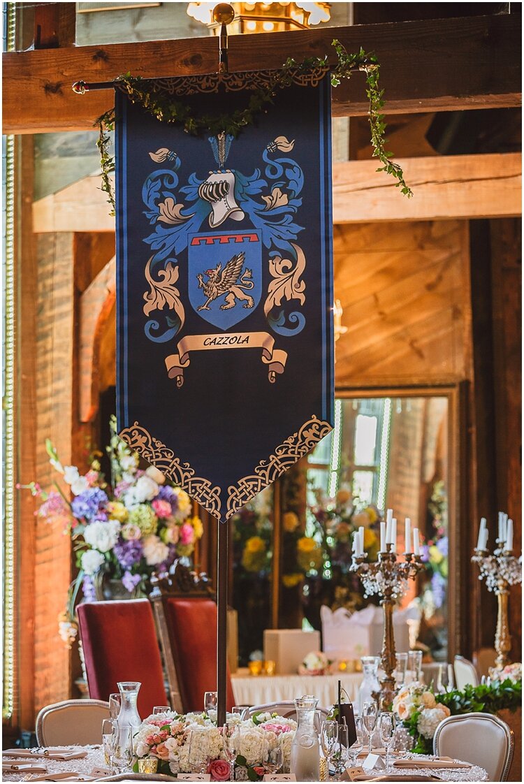
They wanted to create a crest, which was certainly on theme, and was right up my alley. We kept it very formal and used colors from their family’s Scottish clans. I wanted to do a gate fold to add that element of formality and paired it with a wax seal + an art deco style envelope liner.
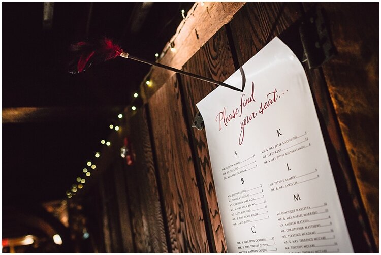
Other fun details at the Bill Miller Castle reception included a seating chart tacked onto the wall with a steel bow, favor notes rolled on wood scrolls, and table numbers hanging on stands. I also loved the rope-like ribbon on the programs. All these details evoked that historical era without feeling tacky or gimmicky. It was definitely an artistic challenge for me, but ended up being a great way to explore not just the design of paper, but how to display the paper goods in creative + interactive ways!
Photos: BSC Photo
So what have we learned? First off, there’s always a way to incorporate a theme or detail that is important to a couple. (The key is to hire a good wedding planner/designer + custom stationery designer to translate it in an elegant, wedding-worthy way! Ok, shameless plug over.)
Also, there are different levels of intensity for any theme. You may want to go all-in like Rebecca + Adam with her fox hunt theme, or you may want to simply sprinkle like Mallory + David. Some themes can be sprinkled and some can be smothered.
But at the end of the day, what’s most important is that your wedding reflects who you are as a couple. So don’t be afraid to say “theme” when describing your wedding to your vendors! This guarantees that your wedding is authentic + unique, and the right vendors will execute your vision beautifully.
Want to better understand what you’re getting when you hire a full-service stationery designer? Check out this post!
LEAVE A COMMENT